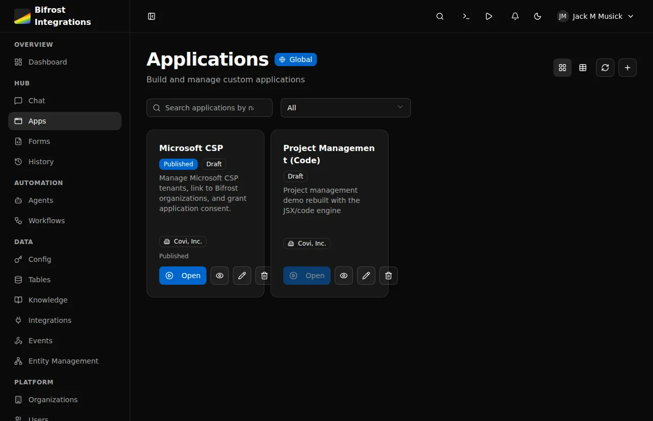
App Builder
Build custom applications with TypeScript/TSX files
What is App Builder?
Section titled “What is App Builder?”App Builder lets you create custom web applications using TypeScript/TSX files. Applications consist of pages, layouts, and components — all rendered by the Bifrost runtime with full creative control over UI.
Key capabilities:
- TypeScript/TSX file-based development
- Pre-built UI components (shadcn/ui) plus custom components
- Custom CSS with dark mode support
- Workflow integration for backend logic via
useWorkflowQueryanduseWorkflowMutation - External npm dependencies (up to 20 packages via esm.sh)
- Role-based permissions
- Automatic routing from file structure
How It Works
Section titled “How It Works”Create app → Add layout → Add pages → Connect workflows → PublishApplication lifecycle:
- Create application with
create_app - Add
_layout.tsxwith<Outlet />for routing - Add pages in
pages/directory - Connect to workflows using
useWorkflowQueryanduseWorkflowMutationhooks - Preview in draft mode
- Publish when ready
Critical Rules
Section titled “Critical Rules”File Structure
Section titled “File Structure”app.yaml # Metadata (name, description, dependencies)_layout.tsx # Root layout wrapper (required)_providers.tsx # Optional context providersstyles.css # Custom CSS (dark mode via .dark selector)pages/ index.tsx # Home page (/) about.tsx # About page (/about) clients/ index.tsx # Clients list (/clients) [id].tsx # Client detail (/clients/:id)components/ MyComponent.tsx # Shared componentsmodules/ utils.ts # Utility modulesImports
Section titled “Imports”Everything comes from a single "bifrost" import:
import { Button, Card, useState, useWorkflowQuery, cn, toast } from "bifrost";External npm packages (declared in app.yaml) use standard imports:
import dayjs from "dayjs";Available Modules
Section titled “Available Modules”- React:
useState,useEffect,useMemo,useCallback,useRef,useContext - Bifrost Hooks:
useWorkflowQuery,useWorkflowMutation,useUser,useAppState,useNavigate,useLocation,useParams,useSearchParams - Routing:
Outlet,Link - UI Components: Full shadcn/ui set — Button, Card, Table, Select, Badge, Input, Dialog, Tabs, Combobox, CalendarPicker, DateRangePicker, and more
- Icons: All lucide-react icons (
Settings,ChevronRight,Search,Plus, etc.) - Utilities:
cn(class merging),toast(notifications),format(date-fns)
Layout Pattern
Section titled “Layout Pattern”The root _layout.tsx must use <Outlet />:
import { Outlet } from "bifrost";
export default function RootLayout() {  return (    <div className="h-full bg-background overflow-hidden">      <Outlet />    </div>  );}
Workflow Hooks
Section titled “Workflow Hooks”Connect to backend workflows using workflow UUIDs:
import { useWorkflowQuery, useWorkflowMutation } from "bifrost";
// Auto-executes on mount -- for loading dataconst { data, isLoading, refetch } = useWorkflowQuery("ef8cf1f2-...");
// Manual execution -- for user-triggered actionsconst { execute, isLoading } = useWorkflowMutation("abc12345-...");await execute({ customer_id: "123" });Example Page
Section titled “Example Page”import { useWorkflowQuery, Skeleton, Card, CardContent} from "bifrost";
export default function HomePage() { const { data, isLoading } = useWorkflowQuery("ef8cf1f2-b451-47f4-aee8-336f7cb21d33");
if (isLoading) { return <Skeleton className="h-32 w-full" />; }
return ( <div className="flex flex-col h-full p-6 overflow-hidden"> <h1 className="text-2xl font-bold mb-4 shrink-0">Dashboard</h1> <Card className="flex-1 min-h-0 overflow-auto"> <CardContent> {data?.items?.map(item => ( <div key={item.id}>{item.name}</div> ))} </CardContent> </Card> </div> );}Scrolling Content
Section titled “Scrolling Content”Your app renders in a fixed-height container. The platform does not scroll the page for you — if a page needs scrolling, add overflow-auto to the element that should scroll.
| Element | Classes | Purpose |
|---|---|---|
| Page root | flex flex-col h-full overflow-hidden | Full height flex |
| Headers | shrink-0 | Fixed height |
| Content | flex-1 min-h-0 overflow-auto | Scrollable |
Permissions
Section titled “Permissions”Application Level
Section titled “Application Level”Control who can access the app via the access_level setting:
authenticated- Any logged-in userrole_based- Specific roles only (setrole_ids)
Component Level
Section titled “Component Level”Hide components conditionally using state:
{user.role === 'admin' && ( <Button variant="destructive">Delete All</Button>)}Managing Apps via MCP
Section titled “Managing Apps via MCP”Build apps using MCP tools:
| Tool | Description |
|---|---|
create_app | Create app metadata |
get_app | Get app info and file list |
list_workflows | Get workflow IDs |
replace_content | Create/update TSX files |
get_content | Read file contents |
publish_app | Publish to users |
Workflow:
create_appwith name and sluglist_workflowsto get IDs you needreplace_contentfor_layout.tsxreplace_contentforpages/index.tsx- Preview at
/apps/{slug} publish_appwhen ready
Next Steps
Section titled “Next Steps”- Code-Based Apps Reference - Complete API reference